
Friday 13 December 2013
A Work in Progress
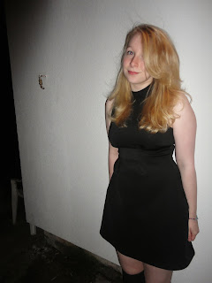
Photo (After Shot 1)
I will be performing another photo shoot soon, however for now these are the first batch of photos with one outfit on a test scenery, (The scenery and location was just for test)


Wednesday 11 December 2013
Magazine Shots (Final Ideas)
Here are some shots to present the ideas I wanted to show to my audience :
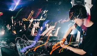
1. Female DJ (electronic Musician)


For this my female model has a selection of dresses that she has chose to wear, each with different colours and with different props (Headphones, Glasses) to show the same image presented above...

The reason I like this is because for female body structure there is nothing that needs to be inventive about the masks, just something that conceals the face, therefore concealing identity, possibly causing more attraction the musician themselves.

Monday 9 December 2013
Magazine Photo Changes
Due to unfortunate delays of not having equipment and being exceedingly unwell, I was unable to complete my photoshoot, because of this I have changed the ideas that I have had for my shots around.

This is now the style of image I will be heading for, though i will create two versions, and have two models to work with...
Version A - 1 - Male (White Background, Keyboard)
Version A - 2 - Male (Broken Building Background, Snapback, Keyboard)
Version B - 1 - Female (White Background, Keyboard)
Version B - 2 - Female (Broken Building Background, Snapback, Keyboard)
Both of these shots will still display the casual outfit of the Electronic Dance Music scene, yet show perhaps the technical revolutions that is allowing DJ's to invent larger than life shows...
Friday 29 November 2013
Magazine Photo Production (Planning, Part 3)
I have wrote this post just as a small update for myself, I will be taking the photos (a variety) for my magazine cover and inside topic photos. I have chosen casual and more frequent teen wear as the clothes for the shots.
This is because the EDM scene has found the artists becoming younger and younger (E.g, Martin Garrix - Animals (He is 17 years old) and so the clothing is not as much stylised as some stage performances are, it is more casual and personal tastes.
I will be using props, One form of DJ deck, and one keyboard/ Synthesizer, though for time referencing I may have to take ones with actors and without, and perhaps super-impose the props. but as I explained in the earlier post, this is all relevant to the scene itself anyway. and if extra shots are needed I will return to an inner location with a clear background so that I can find better background shots to place the actors in.
Some Target Audience & Magazine info...
http://www.slideshare.net/ASmediaJasonSmith/audience-research-compiled
my aim of this presentation was to do a minimalistic case study on the target audience for two magazines (Q, and Kerrang) and to see what some magazines like to do to present themselves to the audience (EDM Weekly)
my aim of this presentation was to do a minimalistic case study on the target audience for two magazines (Q, and Kerrang) and to see what some magazines like to do to present themselves to the audience (EDM Weekly)
Tuesday 26 November 2013
Magazine Photo Production (Planning, Part 2)
In my second set of photos I will be developing a different style to the first set, though using the same actors.
 This photo shows the group 'Krewella' performing live on their 'Volcano' stage, this will be the first of the two shots that will be photo manipulated to create. I will take photos of my models on a clear background, allowing them to be force-edited out, and placed into a new set drop, Of which I will be using a location in liverpool. I will then create a lighting set and 'Stage' for my models with photo-manipulation software. From there I will then also edit a crowd to be performed to.
 This second photo shows the group performing again, but this time it is a back shot, showing them performing to the audience, I will definately produce a shot like this, because it will give me a wider range of photos to select from. and will go nicely as an inside magazine photo anyway. this one will take a few more props to produce, as it will need more physical equipment, however editing of audience and lights will be very straight forward.
My two photo dates are set up for this weekend coming up, I have three models, Sean, Emily and Jenny.
Magazine Photo Production (Planning, Part 1)
For my Electronic based magazine I will be producing all the images that are contained, I have had to reference quite a few different sources to see who, what, why and how I can make a good set of images for this.
I will taking stand photos as close ups that will be a first variation, this will mean that I will have some other choices to use incase I decide otherwise against these photos... here are some examples of that photos I will be taking non-edited.

This is a picture of the artist 'Seven Lions' performing live, I will be taking a shot similar to this with two different people, Male (Sean) and Female (Emily), because this will allow me a range of photos, and it will be easy to plot out props and backgrounds that fit into the design of this photo.
 This is a picture of the artist 'Virtual Riot' performing live, I will be taking a few shots with the same models as before mentioned in this style, as it does not require any after effects and can be recreated with exposure times on a camera. on top of this it will also be quick to do because I will not require a set change (Depending on if I want an audience visible)
Thursday 21 November 2013
Electronic Dance Magazine (EDM mag) audience extract, and style model information..
Here I have an extract from the website of 'Electronic Dance Magazine' which presents some of the features and how they like to appear to their audience.
WHO IS EDM MAGAZINE?
With Electronic Dance Music (EDM) having its own unique culture and arguably being the fastest growing genre in music today, fans need a media source to be informed of what is happening in the EDM scene. EDM Magazine was created to be that media source!
EDM Magazine is the first American magazine that is fully dedicated to the EDM Culture and provides millions of EDM fans with bi-monthly printed issues, Social Media Updates and Digital content to enhance their own EDM Experiences. Our readers get access to exclusive content featuring the hottest EDM Artists, future rising EDM Artists, EDM Festivals, EDM Clubs and of course, the EDM Culture.
EDM Magazine is the perfect platform for your business to be branded to this highly desirable niche audience. We can customize an exclusive marketing plan that will get your company noticed.
Welcome to EDM Magazine!
EDM is a self published magazine, therefore I will have to continue my case study further on Kerrang! and Q, from Bauer media, for my exam work, however I will be presenting and using the style model for my magazine based on EDM Magazine.
EDM is a self published magazine, therefore I will have to continue my case study further on Kerrang! and Q, from Bauer media, for my exam work, however I will be presenting and using the style model for my magazine based on EDM Magazine.
Wednesday 20 November 2013
My Cover Photo (Mise en Scene) (Main Task Ideas)
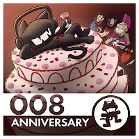
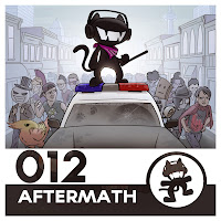
The Brand of my magazine will be as 'Monstercat (Electronic Music)' and will use the featured arists and designs of the existing brand, though I will be taking new pictures and developing a different style without any templates from them (apart from the logo), I will be referencing the style of their branding artwork. Made by Ryan Petirep, who can be found here : http://petirep.deviantart.com/
Here is some of his artwork for the brands compilation albums...

I will be taking the style model of the EDM weekly magazine that shows an interesting style, this will allow me to be a lot more direct and refined with the style of the magazine than any other magazine model would allow me to be. I will be doing a lot more research on a case study for the company that produced EDM weekly.
 Here is another picture presenting the style model that my magazine design will be based on.
Here is some of his artwork for the brands compilation albums...


I will be taking the style model of the EDM weekly magazine that shows an interesting style, this will allow me to be a lot more direct and refined with the style of the magazine than any other magazine model would allow me to be. I will be doing a lot more research on a case study for the company that produced EDM weekly.

Tuesday 19 November 2013
EDM Weekly - My Audience interpretations
From looking at the magazine 'EDM Weekly' and doing a bit more research into the fans of the genre the things that I have managed to pick up are as follows;
Gender - Male and Female, males are more targeted, but there is often a minimal colour scheme more representative of the featured artists rather than for audience attraction.
Age - The age range for readers of this magazine are around 15 to 30. The reason for such a wide age range is because the genre itself has increased so largely in the past year and has become a feature of a huge amount of peoples life. There is both producers, and listeners that will want to read it, and as an older producer, this is why the age range becomes higher. Alternatively in listener ages it would be around 16 - 25 because it is dancefloor/headphone orientated music, therefore this is the regular age to visit shows and gain more personal music tastes.
 As an example I have pulled up this fun cover of EDM Weekly, this shows just how diverse a sensible magazine can make itself depending on context. this is proof as to why my Gender target can be male and female, and the age range can be a lot wider, since it is aimed at teens aswell.
I have made a note of the fact that sexual orientation does not effect this kind of music genre, along with race and education... because these factors are separate from the factor of how people like to enjoy their music.
this magazine has a price range of roughly £5 english money, so we can tell that it is a well written and thought out magazine, and that the audience of the music, whilst loving to 'dance' to the music, also must be intellectual to want to read about it, and therefore will have income to disperse at their will.
From this I have decided that my magazine will cost £5.00 and will be aimed more at people who are gaining 'pocket money' or small forms of dispensable income.
Since the music magazine I have chosen is going to be aimed at a singularly brand of music range, it will be a lot more obvious that the fans/buyers of the magazine will have some loyalty already to the brand and artists that will be featured for it. There will be a bit of an ideal lifestyle design as the readers may want to learn about parts of music production, or things about the artist that they love...
Gender - Male and Female, males are more targeted, but there is often a minimal colour scheme more representative of the featured artists rather than for audience attraction.
Age - The age range for readers of this magazine are around 15 to 30. The reason for such a wide age range is because the genre itself has increased so largely in the past year and has become a feature of a huge amount of peoples life. There is both producers, and listeners that will want to read it, and as an older producer, this is why the age range becomes higher. Alternatively in listener ages it would be around 16 - 25 because it is dancefloor/headphone orientated music, therefore this is the regular age to visit shows and gain more personal music tastes.

I have made a note of the fact that sexual orientation does not effect this kind of music genre, along with race and education... because these factors are separate from the factor of how people like to enjoy their music.
this magazine has a price range of roughly £5 english money, so we can tell that it is a well written and thought out magazine, and that the audience of the music, whilst loving to 'dance' to the music, also must be intellectual to want to read about it, and therefore will have income to disperse at their will.
From this I have decided that my magazine will cost £5.00 and will be aimed more at people who are gaining 'pocket money' or small forms of dispensable income.
Since the music magazine I have chosen is going to be aimed at a singularly brand of music range, it will be a lot more obvious that the fans/buyers of the magazine will have some loyalty already to the brand and artists that will be featured for it. There will be a bit of an ideal lifestyle design as the readers may want to learn about parts of music production, or things about the artist that they love...
Friday 15 November 2013
Magazine Research (Close representations)
Before I get into fully producing my magazine cover I have tried to do as much research into a magazine that is already being produced of the same genre. Unfortunately for myself there is only 1 magazine that is being published around this revolutionary genre, and it is an online magazine.
The genre of my magazine is Electronic Dance Music (EDM) covering all the various genre's of music within the musical society of EDM.
The magazine I have done research into is EDM weekly, this is an online publication featuring big names of the genre, and is published by a self indepent online company of the same name (EDM Weekly) (This also happens to be hosted by two lead members of a big record label who promote the same style music.
 The cover is a lot simpler than other magazines, this is for two reasons A) it's an online magazine ( A lot of features aren't needed) and B) the style of music bases itself around technology, so a more stylistic and blocked out font is fitting, along with Logos of musicians.
There is also a nice neat set up for the rest of the pages which include this range of block style fonts and smart placement. this also fits the genre of music.
The genre of my magazine is Electronic Dance Music (EDM) covering all the various genre's of music within the musical society of EDM.
The magazine I have done research into is EDM weekly, this is an online publication featuring big names of the genre, and is published by a self indepent online company of the same name (EDM Weekly) (This also happens to be hosted by two lead members of a big record label who promote the same style music.


There is also a nice neat set up for the rest of the pages which include this range of block style fonts and smart placement. this also fits the genre of music.
Tuesday 12 November 2013
Music Magazine Conventions... (Presentation)
Here you can view my full presentation on comparing and contrasting two magazine covers choices of conventions.
Music Magazines, Online differences...
To show a bit more understanding, and perhaps to gain a bit more understanding myself I have tried to compare the style of an Online Magazine cover to a physically purchasable magazine.

The reason I have chose to do this is to show how each magazine breaks out of usual conventions and to show much an online cover can differ from a physical. First off, Barcode. there is none on the EDM issue, it doesn't need to bother, as the price will already be discoverable somewhere close by on the device they choose to read the issue on.
Both covers once again have the artist in exceedingly large text with some form of slogan/catch phrase next to them to draw in the readers. Also each magazine has a notable masthead which is a brand logo that audiences/readers will know the magazines for...
The online magazine is a bit more rigidly produced and takes a more sensible style and shape to the physical issue, this is because of two reasons A) the style of music is electronic, therefore a more organised outlook is imagined with the music anyway, and B) as the magazine is online, it is expected to be a sensible yet pleasing to look at cover, which attracts a larger audience.
Overall I think each magazine still uses the obvious conventions of magazines, such as other taglines of information in the issue, to convince a reader to purchase, but i think the online magazine has to have a more professional outlook to brand itself, as it will have a much wider audience, whereas the Kerrang! magazine will already have a regular and understanding fan base for it.
Typical conventions of some Music magazines.
I have chosen to point out some typical features/conventions of two different music magazines (you can see a more detailed review of these features in a coming presentation made by myself).
I have shown three conventions and their placement on each cover, this is to show that though each magazine breaks conventions, they must stick to some regular features (Like the ones that I have listed)


I have shown three conventions and their placement on each cover, this is to show that though each magazine breaks conventions, they must stick to some regular features (Like the ones that I have listed)
 |
| Masthead placement on DJ Mag and NME is very similar in the idea that it is a brand logo, that their audience will know, therefore it is regularly. |

 |
| The main coverline idea is impressive, as both magazines use the same idea of using the band/artist title, then using word placement before each artist title to give a sort of 'draw in fact' for the audience/readers. |

 |
| An obvious feature, though I thought it would be nice to point out how the placement on both the magazines is exceedingly similar once again, it is placed in such a way so that it's out of the way, but is still easily readable. |

Music Magazine Cover Conventions...
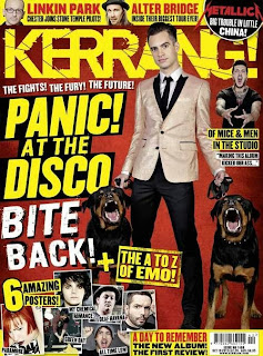
I have chosen to research very specific music magazines to my own taste and a more broader taste for others. For this reason I have chosen the magazines Dj Mag, NME, Kerrang, and EDMweekly (online).
Here are four covers from each magazine.


Here are four covers from each magazine.


The reason I have chosen these magazines is to show two things ; A) I have a broader knowledge of different conventions that different magazines will use to appeal to their audience, B) To show that aswell as my music tastes (EDM magazine), I have appreciation for how other peoples music will appeal to them (However I like all the artists on the featured covers above).
Wednesday 16 October 2013
Sugar Blast Audience
I thought I would take the courtesy to make another post continuing some details on mine and Andrew Houghton's Sugar Blast project. (Now Complete)—
As mentioned before our primary audience is Males & Females aged 16+–—People of these ages often look for soft drinks that are full of relaxed flavour yet provide a useful burst of energy for the day.On top of this we want to see ourselves branding alongside cinemas with our larger cans, perhaps for film tie ins. This is because people are often more likely to spend on bigger drinks at the cinema.
We also like the idea of involving actors with the branding as we have some examples who would enjoy the drink.
People who are highly involved in sport, yet look for a refreshing beverage to enjoy whilst taking a break from the exercise.—The drink will be low priced and will have a more overall demographic which will not exclusive to any ethnicity or public group.—Our product will be styled as inclusive for a bigger audience, but will mainly be directed at a specialist audience of sport people (e.g. Lucozade, Powerade)
Tuesday 15 October 2013
Sugar Blast (Media Audience Targeting Presentation)
I thought I would take the liberty of posting a progress report for one other project which I'm working with my friend Andrew Houghton on. A project called Sugar Blast, a brand of fresh Energy drinks with fruit flavours.
In the presentation we have created we will be explaining the target audience and how we would develop and expand our product towards our audiences.
But for now here is a progress report on the can design.

In the presentation we have created we will be explaining the target audience and how we would develop and expand our product towards our audiences.
But for now here is a progress report on the can design.
The Oldershaw News (preliminary Task) Front Cover
Here I have shown my finished Front cover for my preliminary task, it isn't perfect but I think it shows a considerable amount of effort and design reference to style models.
 I think that using a variety of effects, for instance the shadow effect, has allowed me to depict each seperate part and use of the magazine features.
The tagline is well featured with the front cover photo that I have taken and looks professional enough to be placed with the photo.
I am using the School Badge as part of the Masthead and Logo for the magazine.
I have also added another story, but only the one so it doesn't clutter up the front cover. Though realistically I would have at least 3 to 4 stories on the cover.
I have used a picture of the English curriculum being presented by a teacher with a six former, then a smaller picture of a year 8 pupil presenting the new art exhibition which is on display.
Media Pre-Liminary Task (Contents Page)
This is the finished version of my Contents Page for my preliminary task, I have tried to use colour schemes where appropriate and have provided the necessary information to show the ideas of this contents.
In the two dark red boxes at the bottom which have picture frames next to them will have text in them to display the feature with the pictures.
I have kept the theme the same as the front cover, with the logo at the top, and have just made it smaller as to fit more info onto the page.
I have provided page contents and contact details for the school on the page as these are what you would find on a regular style model of a magazine.
Monday 7 October 2013
Pre-Limary Task (Cover Change)
I have posted an update below showing some work that I have been doing on my preliminary task front cover. In the screenshot you can see myself working in photoshop with the transform and crop tools to resize the image to how I would like it fitting to my cover.

Along with this you can see that I have changed the writing that was shown on my last cover update to a more suitable location, and I have added some effects to make it stand out, like they would on a regular magazine cover you tend to see in stores now a days.
Tuesday 1 October 2013
The Oldershaw Academy (Monthly) - Pre-liminary task update.
This is my current progress on my Pre-Liminary task for media, this is the front cover I have produced for a school magazine so far. I have used my chosen picture from my shots and have done a considerable amount of scaling and graphical work in photoshop to make the magazine look suitable and fitted to the task.


I asked for a good resolution photo of the Oldershaw logo which has placed very well (in my opinion) on the front cover. I need to do alot more work to this to finish the cover. I have a decent amount of experience using Photoshop, however this type of editing for suitable and a more regulated style is a bit different for me. It has been nice to step out of my comfort zone.
Would be nice to hear some thoughts and feedback.
Friday 27 September 2013
Media preliminary task - Final Photo choice
Unfortunately due to unforseen circumstances the second set of photos mentioned in my previous blog have been lost..
So i have chose the second photo of the previous set as my final photo.

So i have chose the second photo of the previous set as my final photo.
- The shot is a medium close-up shot.
- It uses props well to show A) the school and B) intellectual characteristics
- There is a good space on the left for usage of text
- Both the people in the photo are smiling which shows a happy and enjoyable school life.
I think this is the best shot for my magazine cover and will update my progress in editing at a later date...
Thanks.
Tuesday 24 September 2013
My Media Preliminary Task Photos... (Set 1)
For my media work preliminary task I have taken a series of photos which I have put thought into taking for my magazine. I developed two shot ideas and then began to think of some different surroundings and purpose to present this idea well for my magazine cover.
The first set of photos I took for the magazine is for the header "New English Curriculum is Set for the Stars"
 The first shot seen to the right is the exact image I had pictured in my head, and has gone down a treat I think for the cover idea.
It shows, using props, the headline and the location and also involves a smart outlook and presentation for the school. With an obvious connotation to teacher and student relationship.

The first set of photos I took for the magazine is for the header "New English Curriculum is Set for the Stars"

It shows, using props, the headline and the location and also involves a smart outlook and presentation for the school. With an obvious connotation to teacher and student relationship.

Personally out of the two, though this second shot may not seem different, both the people in the shot are presenting smiles and the work is more present in the shot, so A) This presents a good and happy outlook for the school and B) shows that the people are happy with the new curriculum and it has been 'made' by the school...
also there is less room in the background for things that will distract (in the first photo there was alot of ledge and wall) and the only things on show are related to the headline topic, therefore fitting with the shot.
In my next post, you will see the second set of photos which will include my headline photo which I have chose for my front cover -
Thanks for reading.
Subscribe to:
Posts (Atom)