Friday 9 May 2014

Final Product - Double Page Spread of Music Magazine

Double Page Spread final Design -

Here is the final design of my Double Page spread design for my music magazine.

Final Product - Contents of Music Magazined

Contents Page Final design -

Here is the final design of my contents page for my music magazine.

Final Product - Front Cover of Music Magazine

 Front Cover Music Magazine -

Here is my finished design for my music magazine front cover.


Wednesday 7 May 2014

Evaluation 7

7. Looking back at your preliminary task, what do you feel you have learnt in the progression from it to the full product?


My pre-liminary task was influence by general conventions of magazines, since I took Media at GCSE I already had learnt a few different techniques, though I knew this was no where near standard I still tried to put some inventive ideas to use.


I had used the badge with the title as a regular convention as the masthead. And tried to use a nice tagline to catch people attention.


there is a hugely notable difference between my preliminary task and the work that I have made for my Final Coursework piece. I've used a main masthead and a lot more subheadings and taglines to draw in peoples attention. The colour scheme is much more vibrant with a nice ranged colour scheme.

You can see a huge difference in positioning and text placement, this is very similar to my style model of EDM magazine, it presents well my learning curve and ideas.

My masthead is more developed and you can see usage of a lot more regular magazine conventions such as a barcode, dates, and Taglines.


 Though I only got as far as draft work for my pre-liminary, I felt that I made use of placement and regular formal conventions such as phone number and adress. I have also kept the masthead style of the cover.


  • In my full magazine contents you can see a much wider and interesting use of conventions. 
  • I kept the use of social interaction by providing websites and adresses.
  • I added a lot more colour and variation and made sure to provide more images to show content.
  • I made sure my writing was placed at easy background spots with nice colours and text size.
Overall I think I have progressed massively in the ideas of magazine conventions and developing a product for my target audience.

Friday 18 April 2014

Evaluation 6

6. What have you learnt about technologies from the process of constructing this product?


Throughout this process I have used a lot of different pieces of technology to complete all set tasks. a lot of the technology and software I already knew how to use but I learned how to use it more to my advantage. The apple mac computer seen to the right is mostly what I completed a lot of my work on, though there were a few tasks which I decided to complete at home.

The camera to the left is what I used to take both sets of shots for my front cover, over the process of taking these photos I learnt a lot more than I expected. I learnt after my first batch of photos of my first model that they needed to be redone following the simple rule of thirds method and taking note of style models shots. Then in my second batch of photos decided to use a tri-pod and a few more lighting changes (some on camera, some natural) to emphasise the photographs.
 here you can see a screenshot of some of the work I've been producing in photoshop, I already had a very wide knowledge of photoshop since CGI has been a hobby of mine, however I learnt more of  the quick fix techniques and presentation effects that you would see used on regular magazine covers.
I learnt how to use the advanced gradients tool within selections. I learnt how to change the saturation and contrast on my photos to give them a more appealing tone. I also learnt how to use a Skew Motion Blur.
On top of this I learnt how to create groupings to keep my layers in my photoshop files organized and how to crossfade opacities on layers.

     
I used different forms of social networking to gain audience response and to keep continuos updates on my work and research as a developer. I used Facebook because it allowed me to gain specific audience feedback and target my product to the right kind of people. I use blogger to post my research and work, along with other presentation tools such as www.Prezi.com and youtube to present my
Podcasts.

Tuesday 15 April 2014

Evaluation 5

5. How did you attract/address your audience?

To attract my audience since they were specific I made many alterations including the addition of props and items that were more relevant to the specific music culture. Props I've used include Speakers, Laptop (computers), Headphones, Stage lights, Music Software and Albums.


I changed my colour scheme around quite a bit. originally I started with Dark red, Purple and black, But soon after I realised I needed to make something that was more appealing to the younger and brighter generation. so my colour scheme now overall is Pink, Light blue, Dark Blue, purple, and white.


I also altered my title to make it more bright and appealing for the younger generation who appreciate EDM


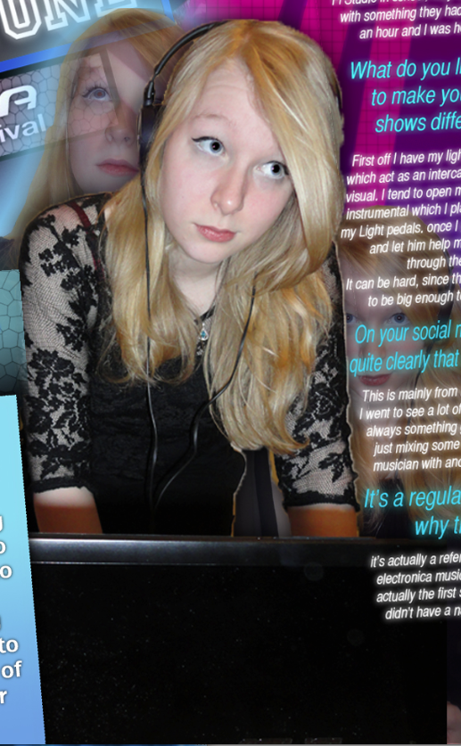
   Here you can see one of the props used to attract the audience. (Left) and you can see lazer lights in the background of the main feature to connote the electronic music scene (Right). Also you can see huge titles that are bright and have a clear colour which will attract the audience to the topic.


Saturday 5 April 2014

Evaluation 4

4.Who would be the audience for your media product?

I have developed my magazine in the sense that it represents the more intellectual and fan group side of electronic music, rather than the event and festival aimed audience. this is because they are more likely to read up on the information provided in the articles.


This audience that I am aiming for consists of both male and females, from 14 years old all the way up to 25, because this would also include a lot more to do with social media, so I think the age limit would have to be capped at 25, though a lot of older people do use it, I feel that only this age group would use it sensibly.

I also have tried my best to use colour scheme to fit in with the audience themes keeping to brighter shades of blue and pink, also using white and black where is necessary to make things look more sensible. (Picture on right)

a lot of my headings and fonts are also kept sensible but stylised shapes to keep it appealing to the younger generations. Glowing blurs also fit with the electronic music audience, since they understand the aspect of live shows and how it connotes 'lazerlights' (see left picture)

Overall I think my audience will react a lot better to this magazine since they're a more specific group of people.

Thursday 3 April 2014

Evaluation 2

2. How does your media product represent particular social groups?

My media product is developed specifically for the Electronic Dance Music culture which has a very specific social group, mostly teens who are into music and tend to converse with their friends about it.

I have used many different conventions to represent this particular social group.


In this shot you can see Laser which represents the older 'clubbing' social groups, however the bright and varied gradients of the bright blue can represent all ages of this social group well. This is because the social group tend to be a more conversation and visually attracted audience (as well as more music orientated).   
another thing which easily represents all ages of this social group is the props I have used, firstly Headphones are always used by these people to listen to their music, also it's usually very well priced headsets. (E.g Sol Republic or Sennheiser, and Beats).


Along with this on my double page spread I have a photo showing both a laptop being used with headphones for the DJ. this represents the technical age that is used and appreciated by the social group.
This also clearly presents with bright pink colours and a female DJ on show that the scene represents females in the social groups.

Evaluation 3

3. What kind of media institution might distribute your media product and why?

Since my magazine is more developed for the younger audience and has a very specific audience, it would be harder to find a publishing brand and distribution centre. (Though I planned for it to be an online/e-read magazine anyway).

I think one main distributor that would publish my magazine is IPC media, the reason I think this is because of two reasons
A) there is a huge gap in the market for a magazine that advertises this kind of music for the younger generation. 
and B) as of now they only promote the music brand NME which is mainly directed at chart music or whichever brand of music is developing strongly. so there is no specific brand, yet all the magazines have very exact target audiences...

I think they would appreciate publishing my product because as previously stated my magazine has a very precise and large target audience which fits in with the brands that IPC promote. if we look at the design of this NME cover below you can see the similarities between the bright style colours and text placement, so I think my design will benefit them more.


Tuesday 1 April 2014

Evaluation 1


Evaluation 1 : In what ways does your media product use, develop or challenge forms and conventions of real media products?


I personally think I have been able to develop the conventions of a typical magazine very well with my product. however I have tried to use my brand and style to challenge some typical conventions. my double page spread shows my most usage of breaking regular form, this is because of the layout and design. as a style model I used the EDM Online magazine as this best fitted the genre and audience that I was trying to promote and attract.

 If we look at the title of an Issue of EDM online magazine we see that it is a simple name (alias) next to a logo, and some text.

I decided to keep as much of this design as possible whilst keeping my text and fun  appealing to read for my audience. A simple set of headphones next to a Logo, I have had to include the festival logo since it is subject matter, but I have tried to take up the bottom of the page completely to make it aware to people that it is the main feature. this is me sticking to usual conventions.

If we look at this in comparison to the full cover of EDM.
 you can see that I have followed the idea of keeping the main feature at fore front, whilst bringing all other features around. The title positioning will also help to keep the magazine in a very statutory and easy to read feel.


one way that I've tried to break usual conventions is by changing the style of my contents listing. that's whilst keeping some conforming features...

I have use the 'features' subtitle, but other than that, I found it more interesting to use coloured squares to highlight a different topic, and using a preview image of the poster.

I believe that placing the numbers on opposite sides will keep the reader attracted and interested.
On the double page spread  I have tried to break the conventions of a usual magazine by using a tilt design to present my info and interview, though this is largely based on my style model. I have tried to keep the ideas as original as possible.

 I have decided to use the convention of usual social media links (The bottom of the picture) I have also included the page number in the top corner.

Another convention that I have kept is to keep my main images and acts central, using lights and stage in the background, I feel this presents the feature a lot better.


In comparison with my style model I have tried to use a lot brighter colours since I think they best suit the Electronic Dance Music scene and the audience that I'm trying to attract.

Tuesday 18 March 2014

Magazine Page Progress report...


Here is my updates on my magazine, I have changed the angling and colour of text, added some regular conventions, I will now for the rest of this time period begin to answer questions explaining my work...


Friday 14 March 2014

Photo Shoot: 2nd Arrangement

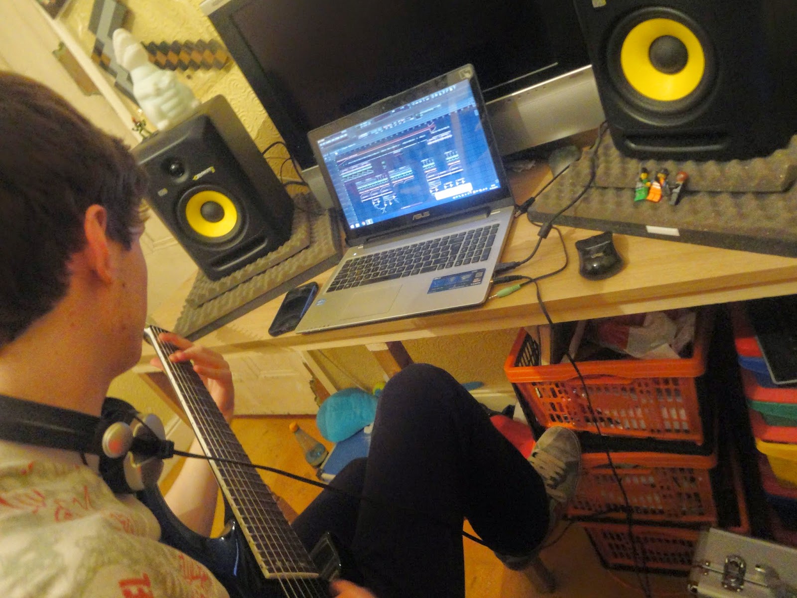
 Here you can see a selection of photos from a set of 39 photos taken for a second photoshoot in aid of developing my front cover.

My friend Sean lent me a hand and we set up some nice shots in a typical 'bedroom studio'.

I wanted to try many new techniques which would develop my photos better than the first set of photos. Even though this isn't the main shoot. I still felt i developed my skills as a photographer.

To make authenticity we already had a lot of equipment ourselves (since we're both music producers already) so it was quite easy to make realistic and nice shots for my magazine.


 Alot of these shots were to display the idea that my magazine shows interesting theory about music, with artists that appeal to the audience, but are still enjoyable to see the lifestyles and production flow of.

I think my pictures have perfectly represented my aims, and I had a lot of fun with the end shots to join my main front cover shoot as well!

 l like how the pictures are very casual at somepoint, for instance, the xbox at the side shows that he's just a regular person, it's a typical bedroom.


This shot accurately showed every piece of equipment that is connoted to the music production side of EDM. that is slowly entering synergy with rock and metal music.