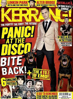
The reason I have chose to do this is to show how each magazine breaks out of usual conventions and to show much an online cover can differ from a physical. First off, Barcode. there is none on the EDM issue, it doesn't need to bother, as the price will already be discoverable somewhere close by on the device they choose to read the issue on.
Both covers once again have the artist in exceedingly large text with some form of slogan/catch phrase next to them to draw in the readers. Also each magazine has a notable masthead which is a brand logo that audiences/readers will know the magazines for...
The online magazine is a bit more rigidly produced and takes a more sensible style and shape to the physical issue, this is because of two reasons A) the style of music is electronic, therefore a more organised outlook is imagined with the music anyway, and B) as the magazine is online, it is expected to be a sensible yet pleasing to look at cover, which attracts a larger audience.
Overall I think each magazine still uses the obvious conventions of magazines, such as other taglines of information in the issue, to convince a reader to purchase, but i think the online magazine has to have a more professional outlook to brand itself, as it will have a much wider audience, whereas the Kerrang! magazine will already have a regular and understanding fan base for it.

No comments:
Post a Comment