Tuesday 18 March 2014

Magazine Page Progress report...


Here is my updates on my magazine, I have changed the angling and colour of text, added some regular conventions, I will now for the rest of this time period begin to answer questions explaining my work...


Friday 14 March 2014

Photo Shoot: 2nd Arrangement

 Here you can see a selection of photos from a set of 39 photos taken for a second photoshoot in aid of developing my front cover.

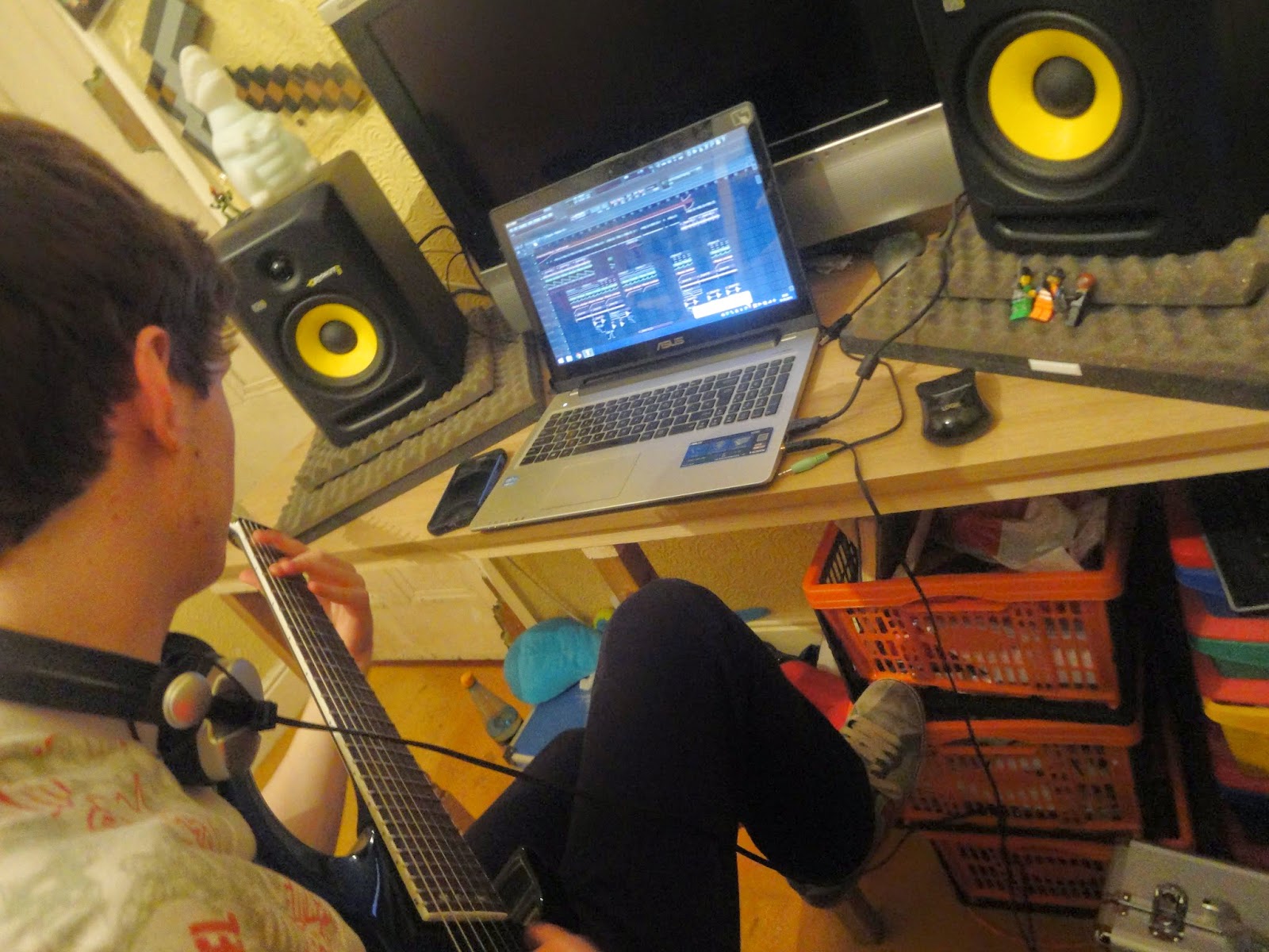
My friend Sean lent me a hand and we set up some nice shots in a typical 'bedroom studio'.

I wanted to try many new techniques which would develop my photos better than the first set of photos. Even though this isn't the main shoot. I still felt i developed my skills as a photographer.

To make authenticity we already had a lot of equipment ourselves (since we're both music producers already) so it was quite easy to make realistic and nice shots for my magazine.


 Alot of these shots were to display the idea that my magazine shows interesting theory about music, with artists that appeal to the audience, but are still enjoyable to see the lifestyles and production flow of.

I think my pictures have perfectly represented my aims, and I had a lot of fun with the end shots to join my main front cover shoot as well!

 l like how the pictures are very casual at somepoint, for instance, the xbox at the side shows that he's just a regular person, it's a typical bedroom.


This shot accurately showed every piece of equipment that is connoted to the music production side of EDM. that is slowly entering synergy with rock and metal music.


Thursday 6 March 2014

Second Feedback, Peer Review/Feedback

The second set of feedback I gained was from the online forum EDMDistrict which is used to gain feedback on anything related to the Electronic Dance Music world (music, Social, Logos, Art, Etc...)

One of my friends Lars, who runs the facebook social group, promotion channel, and music retail website for JustAnother Visual - http://www.youtube.com/user/JustAnotherVisual , gave me some exceedingly useful feedback that was in full relation and helped me a lot on how to better develop my magazine to my target audience.

Lars Oslen
"1) The girl used on every page looks really nice, would like to the images a bit more developed (larger?) and try to show some more equipment or stage visuals to keep it related to the topic... alternatively take some more photos with some different artists?

2) The title needs to be a little more "Official". Maybe something that uses a better shade of blue is appealing and will catch your audiences eye?

3) Change the colour of the double page spread questions to something other than pink. it's hard to see against the background and will instantly put your audience off, since they don't want to have to make effort to actually read up on the topics they enjoy.

4) I like the tilt for the interview, very individual, but I personally would tilt it a little more straight so it's easier to read and understand!

5) Your colour scheme is fantastic, but don't forget to be a little bit plainer with your designs, try some white blocking (like you have on your front cover) in the rest of your designs!"

The reason I have been very subtle about asking for feedback is so that I get more proffesional reviews.

First Feedback, Peer Review/Feedback

Using a range of social media (Facebook, Twitter, and Various Electronic Music Forums) I have managed to construct useful feedback amongst peers to make suitable changes that will push forward the model of my magazine plans, without changing the target audience or demolishing it's irregular conventions.

The first feedback I gained was via Facebook, I asked a few friends who were in the loop of this genre of music to take a look at the magazine. I knew I could trust my friends to give constructive feedback that would actually help me to develop the ideas. My friend Sean, who actually runs a social youtube channel for the promotion of electronic music, gave the first feedback on Facebook.

Sean Plimley
"Taking all three picture into consideration, the style of the magazine fits what it is about, strobe lights and all that, you should make the writing on the double page spread a different colour because it blends in too much which makes it difficult to read, maybe blend the two pages together a bit more. The front cover looks amazing! but in my opinion the title needs to be moved higher up to fill the space. The contents page whether it's a work in progress or not definitely needs a bit more, perhaps some DJ equipment or what's inside the next issue or more pictures of what's inside. But overall it's a really strong style and fits with the genre of music, also you're using a lot smaller artists to advertise which I guess is nice to see"

I thought that this feedback was really useful, and will help me to make some simple yet effective alterations, also it confirmed to me that the magazine is appealing to the target audience I'm aiming for.